Roos asked for a recognizable logo that would reflect her colorful and dynamic style, with a modern yet timeless look. The goal was to establish the Bloemen van Roos brand as a reliable name for unique bouquets, composed with love and care.
I ended up designing and choosing the logo that’s underneath the rest after many changes and feedbacks, it is a recognizable logo that matches the requirements and details that the client ask for, with a nice clean look and a matching slogan.
Mock-ups
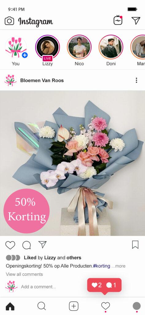
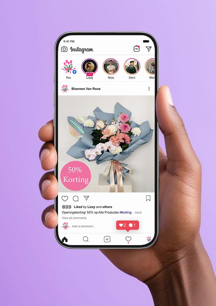
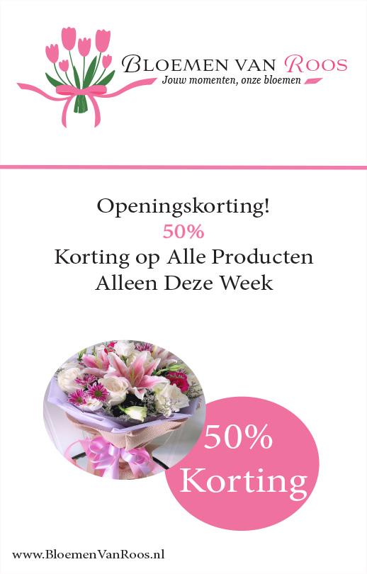
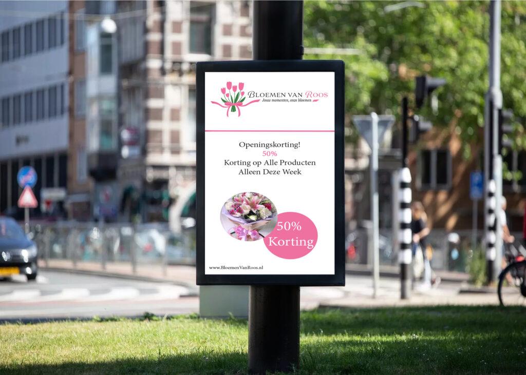
In this exercise we had to make an insta post and digital abri that matched Roos Tennapel’s request. I used colors that match her personality, the color pink stands for a loving and kind individual, which in my opinion suits Roos very well.
I put my instagram posts and digital abri in a realistic photo so that I could create a vision of what they would look like in real life.
It was a really nice experience to get and design all of these little things that in the end created a whole personality for the company.